
2025 Pantone Colour of the Year
- Jan 9, 2025
- 4 min read
Underpinned by our desire for every day pleasures, PANTONE 17-1230 Mocha Mousse expresses a level of thoughtful indulgence. Sophisticated and lush, yet at the same time an unpretentious classic, PANTONE 17-1230 Mocha Mousse extends our perceptions of the browns from being humble and grounded to embrace aspirational and luxe. — Leatrice Eiseman, Executive Director Pantone Color Institute

The 2025 Pantone Colour of the Year
Every year, Pantone reveals its Colour of the Year, sparking creativity and innovation across industries from fashion to interior design and, of course, promotional marketing. Score Promotions sees the Pantone Colour of the Year as more than just a hue; it’s an opportunity to refresh branding strategies, captivate audiences, and set businesses apart from the competition. For 2025, the chosen colour is Pantone 17-1230 Mocha Mousse, a rich and versatile shade of warm, earthy brown that’s bound to create an impact.

Why the Pantone Colour of the Year Matters
Colour is one of the most powerful tools in marketing. It grabs attention, conveys emotions, and shapes perceptions. Mocha Mousse exudes warmth, sophistication, and stability which are qualities that resonate deeply with today’s consumers. When a colour like Pantone’s 2025 pick is recognized as a global trend, it gives brands a chance to align their campaigns with contemporary aesthetics and cultural relevance. By incorporating this colour into your promotional products, you’re not just staying on-trend, you’re showing your audience that your brand is forward-thinking and in tune with the latest design movements.
Design Tips for Incorporating the 2025 Colour
Pair It Strategically: Mocha Mousse pairs beautifully with neutrals like gray, beige, or white for a clean and modern aesthetic that feels timeless and versatile. For a bolder approach, combine it with complementary or contrasting colours like deep blues, soft greens, or even warm terracotta and mustard yellow for an earthy, grounded palette.
Subtle Accents: If a full-colour product feels overwhelming, use the shade as an accent. For example, a notebook with a coloured spine, a water bottle with a tinted lid, or a tote bag with contrasting handles can make a subtle yet impactful statement. Similarly, incorporate the colour in stitching, zippers, or logo details on apparel, or use it in decorative borders, trims, or interior linings on packaging to add a refined touch without overpowering the design.
Textures and Finishes: Experiment with different textures or finishes (e.g., matte, metallic, glossy or embossed) to highlight the colour in unique ways, adding depth, dimension, and tactile appeal to your designs, whether on promotional products, packaging, or digital content.
Seasonal Themes: Consider how Mocha Mousse can align with seasonal campaigns. For spring, combine it with pastel tones like blush pink, mint green, or soft lavender for a fresh and inviting look. For summer, pair it with vibrant tropical colours like coral or turquoise to evoke warmth and energy. For fall, blend it with deeper, richer hues such as burnt orange, burgundy, or forest green to create a cozy, autumn feel, and for winter, team it with icy blues, silvers, or crisp whites to convey elegance and sophistication.
Social Media Aesthetics: Use Mocha Mousse as a backdrop for product shots to emphasize the natural tones and textures of your items, creating a warm and professional look. Enhance story highlights by using the shade in icon designs or as a consistent background across all highlight covers, ensuring a polished and unified brand presence. This earthy tone pairs well with bold fonts and contrasting colours, allowing your text and visuals to stand out while maintaining an approachable and sophisticated feel.
Colour of the Year Palettes and How to Use Them
Relaxed Elegance: create products that embody simplicity, comfort, and understated luxury. The warm tones of Mocha Mousse evoke a sense of calm and indulgence, making this palette ideal for lifestyle products such as cozy apparel, home décor, and wellness-focused gifts.


Easy Rest Aromatherapy Sleep Mask: choose a complementary colour like cream tan, a soft and
neutral hue that exudes warmth and sophistication, perfectly aligning with the Relaxed Elegance Palette.
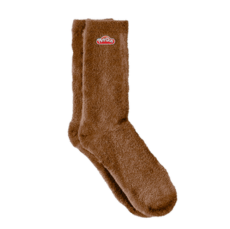
Fuzzy Socks: to elevate the aesthetic appeal, opt for a darker shade of the Colour of the Year, such as a rich espresso or chocolate tone. This deeper hue not only adds a touch of depth to the design but also creates a striking contrast that makes your branding or message stand out beautifully.
Glass Jar Candle: incorporate different shades from the Relaxed Elegance Palette into your typography to create a visually engaging and harmonious design. Using a mix of tones can help establish a clear visual hierarchy while maintaining a cohesive and elegant aesthetic.
Floral Pathways: a harmonious palette of soothing florals, soft mocha, and shaded willow green, crafted to enhance branded merchandise with a subtle, natural elegance. This versatile palette works beautifully on apparel, bags, and lifestyle products, offering a serene, cohesive brand aesthetic inspired by nature.


Knit Cuff Toque: using a light background paired with darker branding creates a fresh, clean, and approachable aesthetic, offering a timeless design approach that emphasizes clarity and simplicity. A light background in shades from the Floral Pathways Palette sets a bright and inviting tone, serving as a neutral base that enhances focus on your branding elements.
JBL Vibe Beam True Wireless Earbuds: using one solid colour from this palette for your design creates a unified and polished aesthetic that exudes comfort and refinement. This approach simplifies the overall look, ensuring that the chosen hue becomes the centerpiece of your branding.
Recycled Leather Pouch: the opposite approach from above, for the branding element, choose light and airy colours from the Floral Pathways Palette to create a high-contrast effect. These lighter tones not only draw attention to your logo, typography, or graphic elements but also evoke a sense of elegance and refinement.


Comments